


The Tennessee Titans hit the reset button hard. While Robert Saleh rebuilds the roster, management is revamping the franchise’s image, starting with a new logo that has caused a stir on social media, and not in a good way.
This Monday, an image of a supposed new Titans logo leaked on the Fanatics on X account (formerly Twitter). The photo shows a plush football with a much simpler logo than the current one.
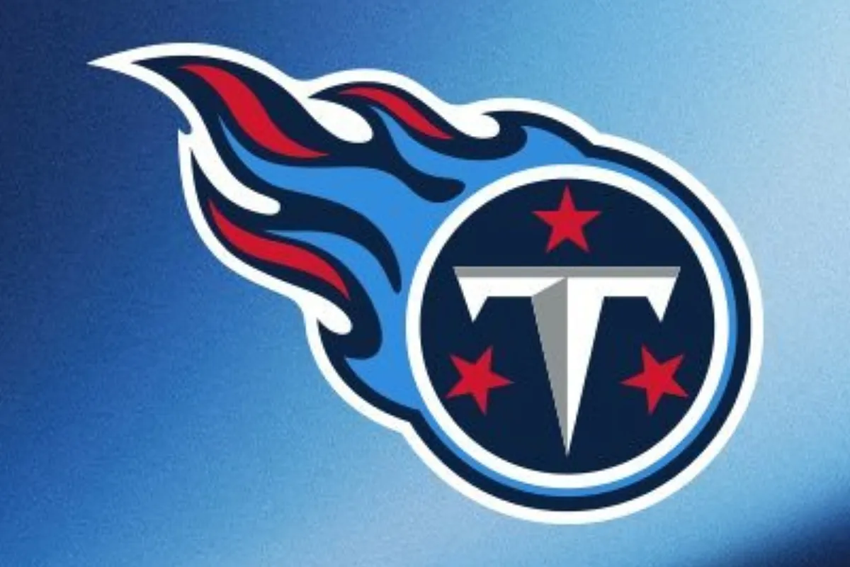
The new logo would be just a stylized white “T,” flanked by three white stars, inside a light blue circle with a red outline.
Although the account had already taken down the image, it was too late. Insiders and fans didn’t hesitate to give their opinions, most of them very unfavorable.
The Titans’ new logo “Disaster”
Outkick writer Mark Harris expressed his disappointment with the proposed Titans’ logo. “[It] looks like something a young child with incredibly average artistic abilities put together,” he said.
- Most fans agreed with Harris, with opinions like:
- “If this is truly the new Titans logo, it immediately becomes one of the worst in the NFL.”
- “I don’t know how this graphic artist got the job or got paid for this. It breaks all the rules of graphic design.”
- “From bad to worse. Are they even a real team anymore?”
However, not everyone was disappointed. Some recognized the nostalgic appeal of the so-called “Oilers blue” color.
A tribute to the Houston Oilers?
Harris himself admitted that the logo will look better on other items, especially a white helmet. Furthermore, he admitted that if the color they use is Houston Oiler blue, “it’s a home run no matter what the logo looks like.”
Some fans considered the rumored new logo an improvement over the current one. Others compared it to logos like those of Green Bay, Pittsburgh, or New Orleans, which represent the team’s home.
Finally, others said that their own teams’ logos are worse, so Titans fans have no right to complain.
Read the full article here


