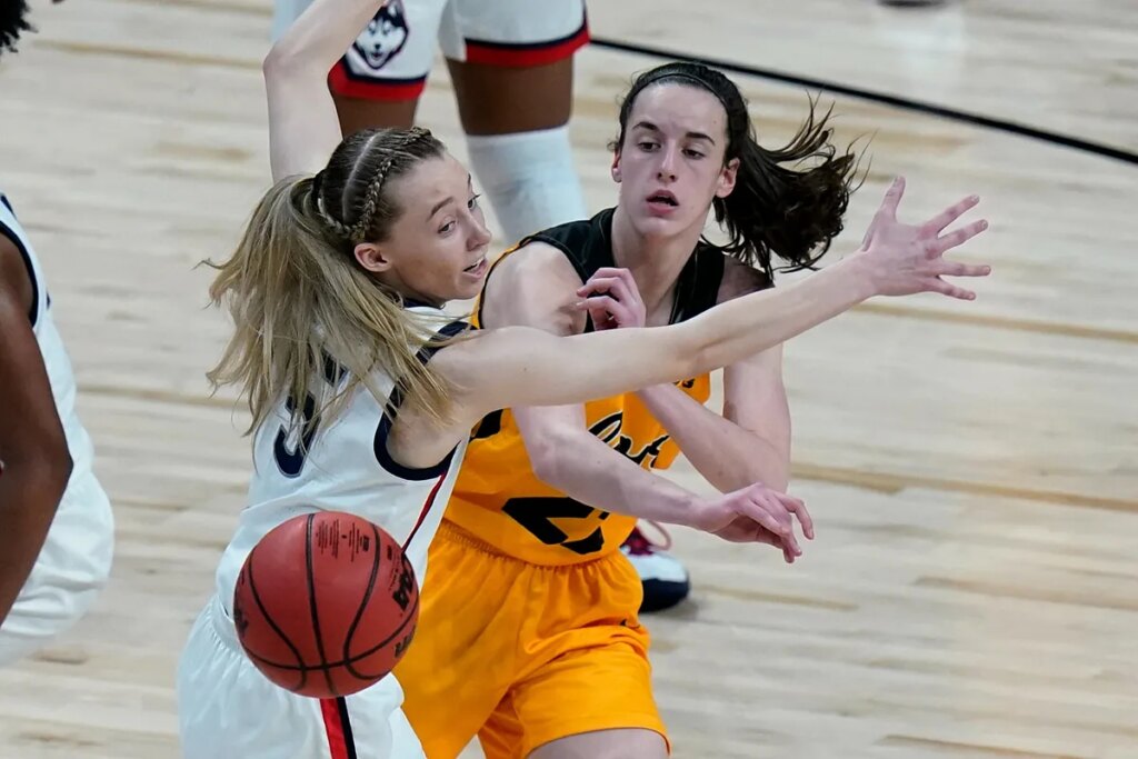
Caitlin Clark and Paige Bueckers have yet to face each other on a professional court, but that hasn’t stopped fans from debating who comes out on top – both in the game and in branding. The latest spark? Nike’s unveiling of Clark’s new personal logo.
The comparisons first flared in July when the Indiana Fever faced the Dallas Wings. Clark, sidelined with an injury, arrived in a sharp retro white suit that screamed “Gucci Girl,” while Bueckers rocked casual denim.
The tunnel looked more like a Hollywood red carpet than a WNBA arena, and fans quickly noted just how different the two stars are off the court. Now, Nike’s debut of Clark’s logo has reignited the rivalry. Critics say the interlocking “CC” design looks too corporate and fails to reflect Clark’s playful personality on the court.
Nike darkened Caitlin, made Paige shine
On No Offseason: The Athletic Women’s Basketball Show, Zena Keita and Sabreena Merchant praised the detail-packed creativity of Bueckers’ Nike PE – from lavender and baby-blue colors to her father’s stitched pre-game message – while describing Clark’s logo as “just fine.”
“When you think about Paige and the PB logo with the buckets, that’s fun,” Merchant said. “I wanted a little more of Caitlin’s personality… this didn’t serve Caitlin in terms of making her more than this corporate vibe.”
Caitlin has little to worry about
Still, if Clark’s past merchandise launches are any indication, her new line will be an instant sellout. Her draft-day jersey disappeared in an hour, her All-Star edition had fans begging for restocks, and her Kobe V Protro release sold out in minutes.
While critics may nitpick her branding, Clark remains one of the most bankable stars in sports. And if she returns from injury in time to lead the Fever into the playoffs, 2025 could become a signature year – logo debate or not.
Read the full article here

